Dev Diary #1: Establishing The Gameplay And Style Of AGAINST
Author: indiefoldcreator
Date:
Sat, 13 May 2023
Game: AGAINST

Genre:
Action, Casual, Indie, Early Access
Developer: Joy Way
Release Date: Thu, 16 Dec 2021
Developer: Joy Way
Release Date: Thu, 16 Dec 2021
AGAINST – a combat rhythm game by Joy Way
Here at Joy Way, we LOVE mixing genres and gameplay mechanics. For a long time, our game designers wanted to make a rhythm game that would seem fresh but familiar to fans of the genre. It took some time to decide on a game mechanic that would be unique to the market, but we think we have finally found a winning formula!
The search for our own style and gameplay led us to create AGAINST, which we plan to release in the third quarter of 2021.
Let us tell you how the game was created and what players will get on the release.
https://store.steampowered.com/app/1584840/AGAINST/
The birth of key game mechanics
The lead game designer of AGAINST, Aidar, has a fondness for rhythm VR games. Pistol Whip, Beta Saber - these projects made great impact on the industry, being system sellers and the first choice for newly arrived VR gamers. And for a long time, while we were working on Stride and other projects, our developers wanted to give this genre a try. Although the genre is considered oversaturated, Aidar had his own vision of what could be brought to it.
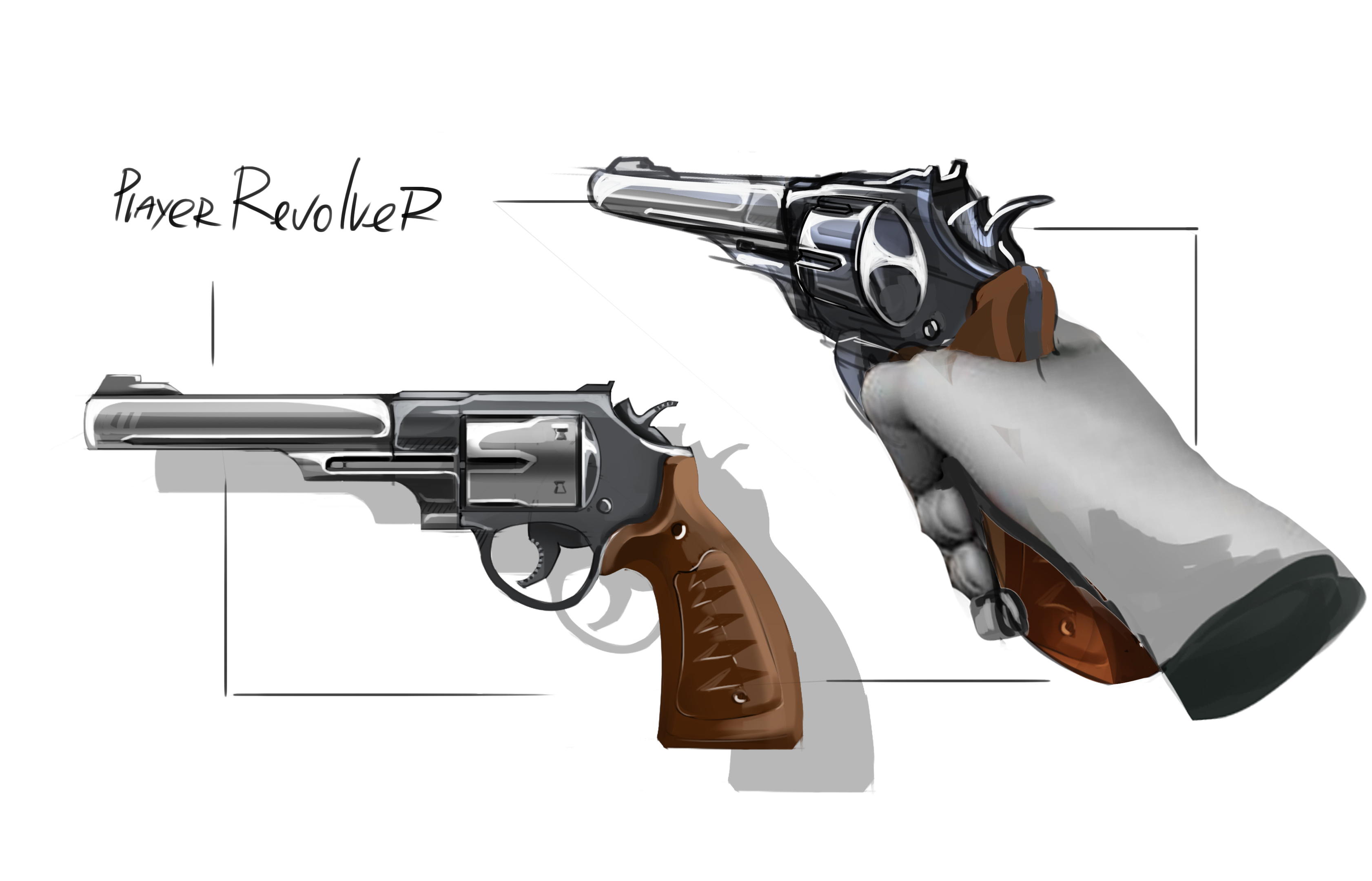
The player's arsenal is not limited to the sword
Aidar tried to combine the mechanics of slicing and shooting, which was generally similar to how Pistol Whip works, but there was a problem - we wanted the player to quickly switch between the weapons, following the beat. We had the following options:
- the weapon automatically switched at the right moment. This was confusing for players. They didn't feel like they were in control of the game;
- the weapon could be switched with a button. This created an additional challenge for the player who was distracted by that, instead of focusing on the rhythm;
- the weapon appeared in front of the player for them to grab when needed. This idea worked for us, because when the player sees the weapon in advance, they already know what they should do next. In addition, the moment a weapon appears and is picked up is synchronized to the rhythm, which works in favour of the overall concept of the game.
Based on this idea, we have mocked up a prototype of the game. Prototyping is one of the most effective tools in game design, as it allows you to quickly see whether your ideas would work in a real game.
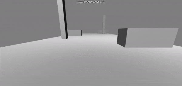
The first prototype for testing basic mechanics
The prototype was approved inside the studio, and we also realized that we were not limited to the sword and pistol and could add any weapons and new mechanics as long as the moments of their activation coincides with the rhythm of the musical composition. That's what led us to brass knuckles and the movement mechanics.
Locomotion and similarities with Stride
As for locomotion, we believe that it has a very strong impact on VR immersion, and that point & teleport locomotion should be forgotten as a relic of a bygone era. This idea was elevated to an absolute principle in Stride, with free locomotion based on the player’s body movements. But despite that, we decided that AGAINST should utilize the “on rails” type of locomotion in order to reduce the difficulty curve for casual players or players, focus on the rhythm aspect of the game and reduce potential motion sickness.
However, we have taken some of the best practices from Stride and added running, jumping and wall-running to AGAINST to diversify the gameplay.
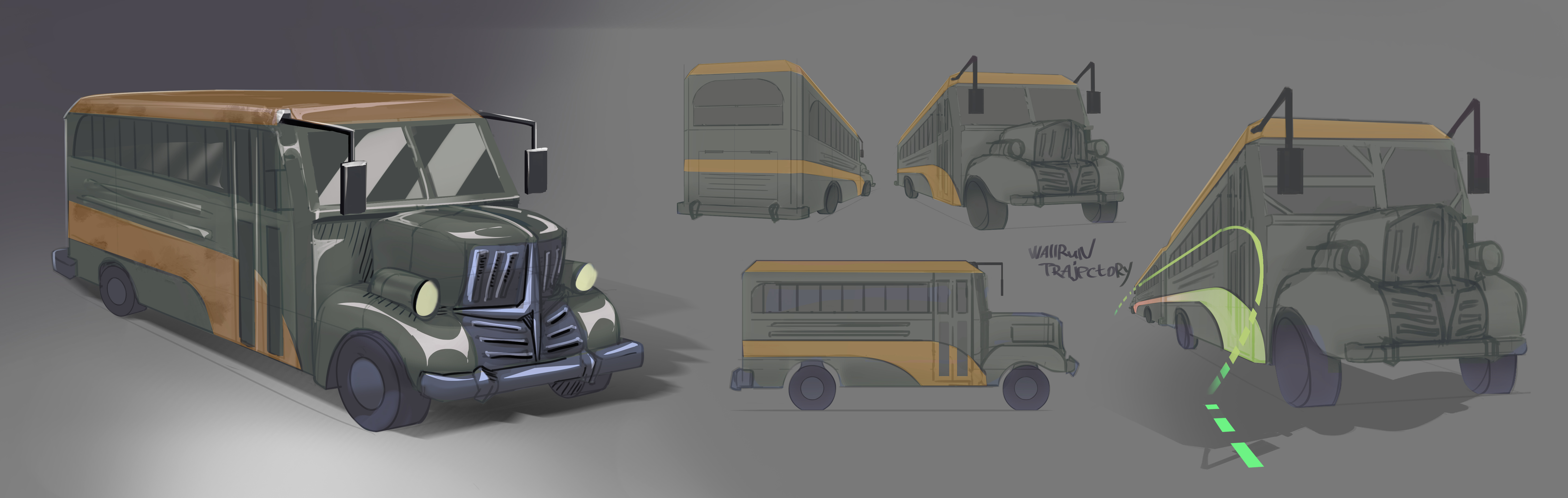
Wall-running derived from Stride
Visual style: how it started
The visual style is very important for us, because it either hooks a potential player, or makes the game look like another clone of SUPERHOT or Pistol Whip.
As we started with the gameplay prototype, the initial style was corresponding: simple shapes and colors; low-poly, easy-to-make models. We started experimenting, and our artists prepared a lot of concepts.
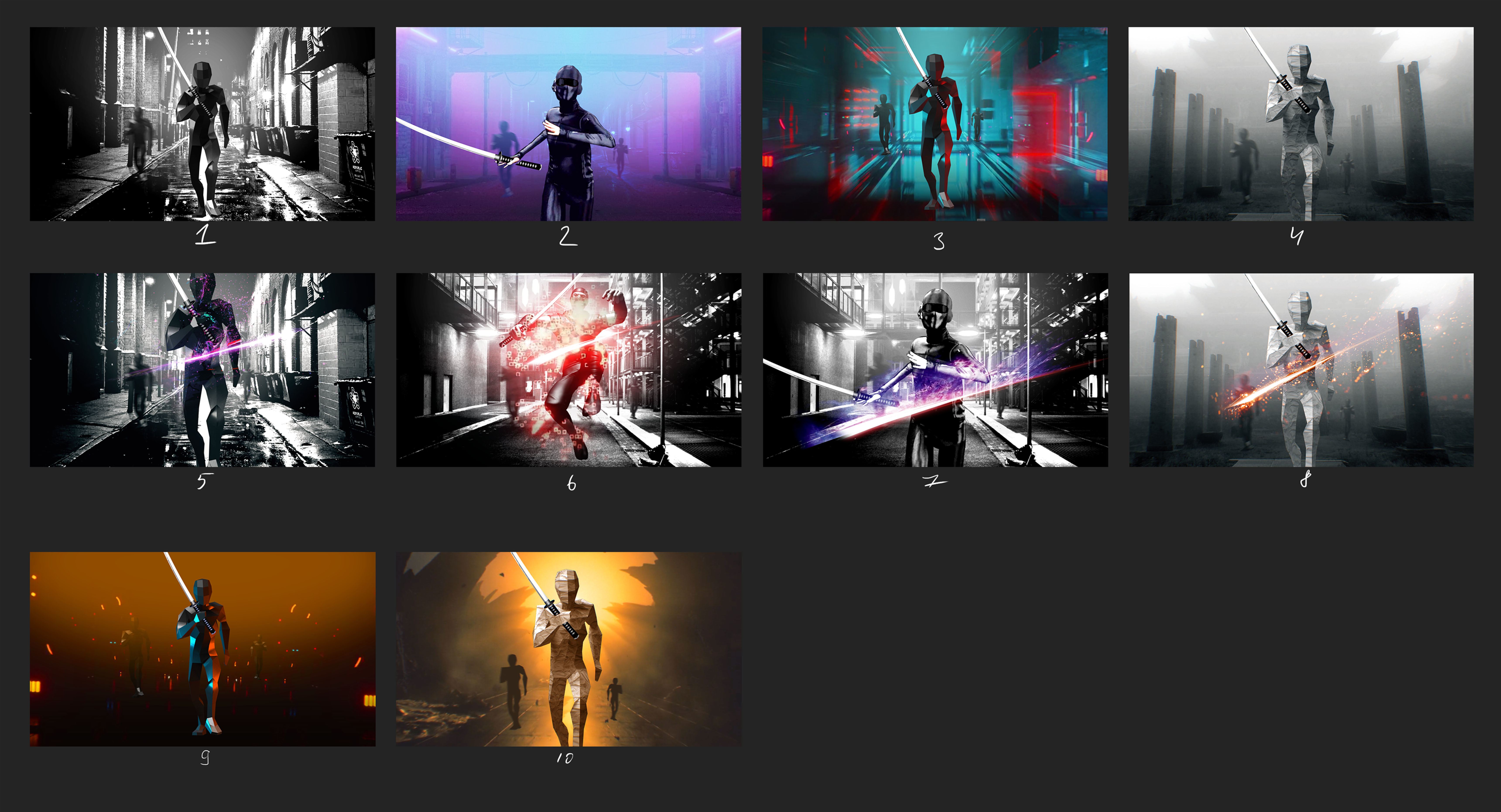
Initial concept art
At some point, we decided on a digital Tron-esque style. Our 3d designer shaped the level, threw a bunch of particles in, adjusted the light, and it was ready. We recorded a gameplay video that was posted on Reddit to collect initial feedback.
Many positive reviews and well-reasoned criticism were received, so we made the final decision to make this game. Everything looked nice in the video, but the visual elements in actual VR were overwhelming the player due to the large number of particles and bright elements around. Enemy animations were hard to read, which is a big no for a rhythm game.
The search continued.
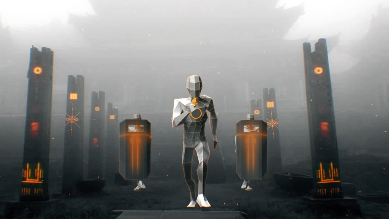
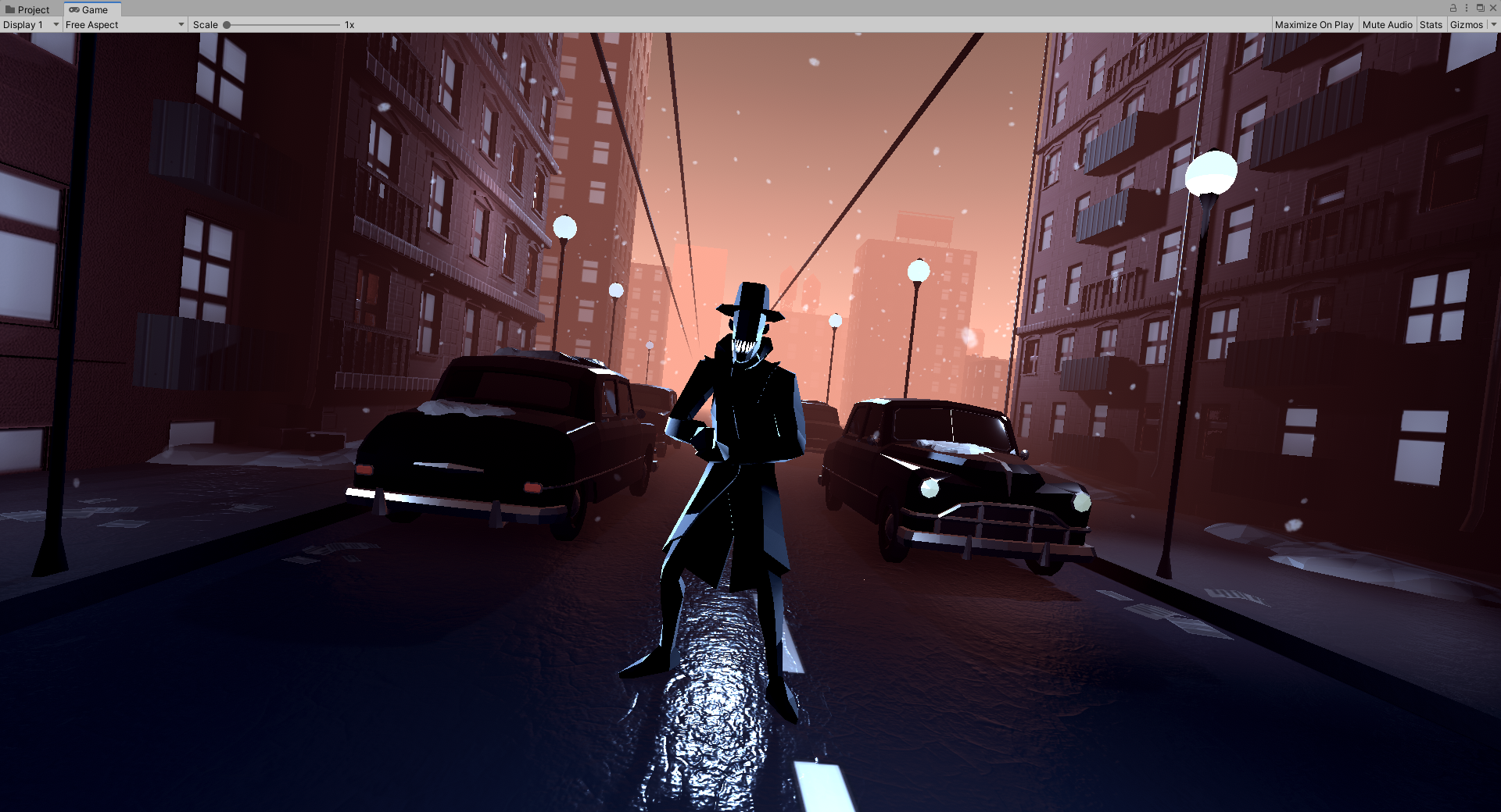
The gritty noir style
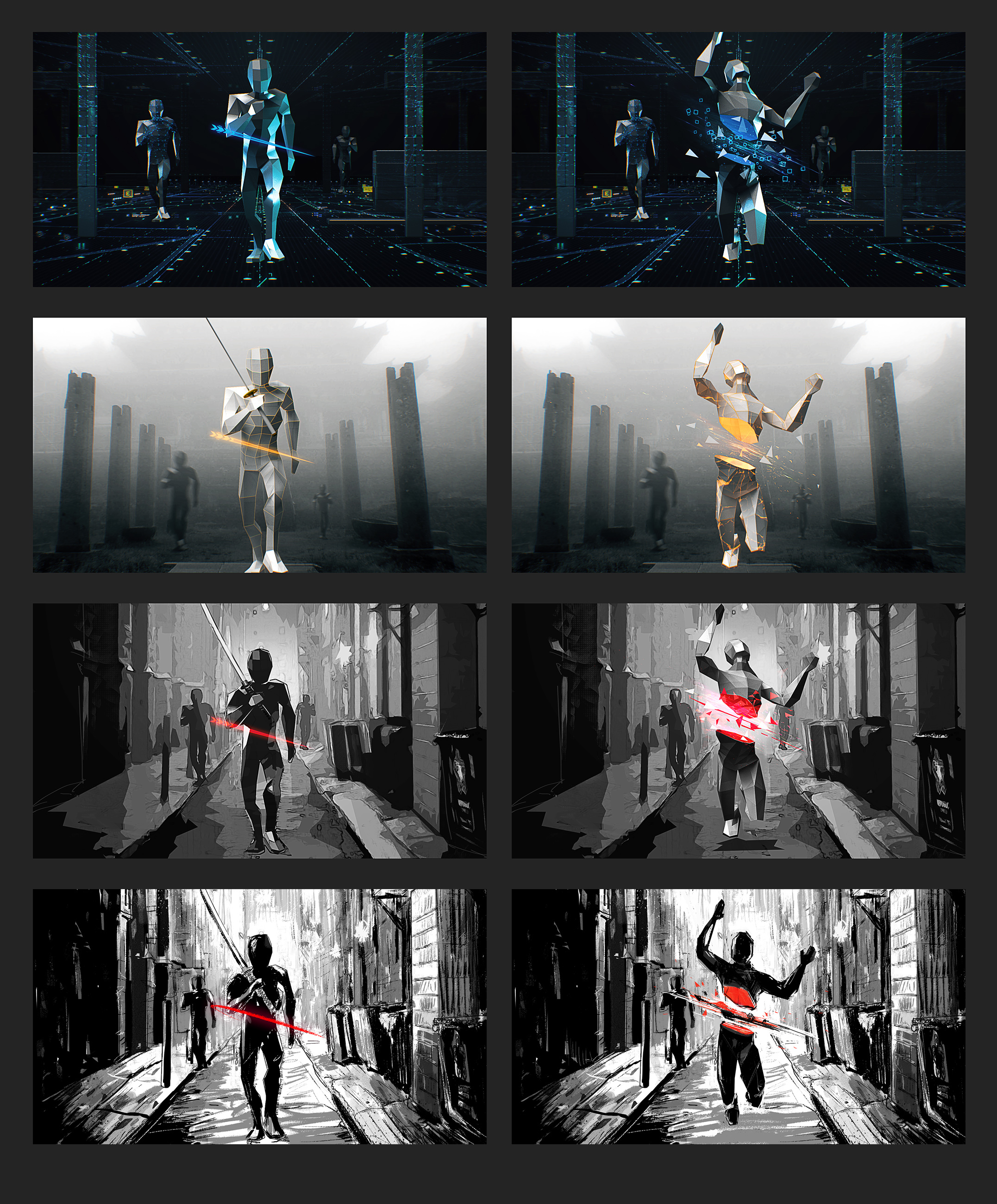
Concept art evolution
One of the most popular options within the team
However, almost all options were similar to variations of SUPERHOT or Pistol Whip. We decided to try something radical and started looking towards the gangster aesthetic of America in the early 30s.
It was important for us to convey not only the scenery, but also the crushing atmosphere of the Great Depression era, when a person’s own fears were even more dangerous than the marginalized social elements that flooded the night streets of New York.
Concept art that formed the basis of the final style and spirit of the game
That’s how a style was born that was unlike any other rhythm game, which reflected our vision and fit well with the gameplay.
However, just like in the first prototype, enemies kind of blended in with the background environment.
The enemy blends in with the environment
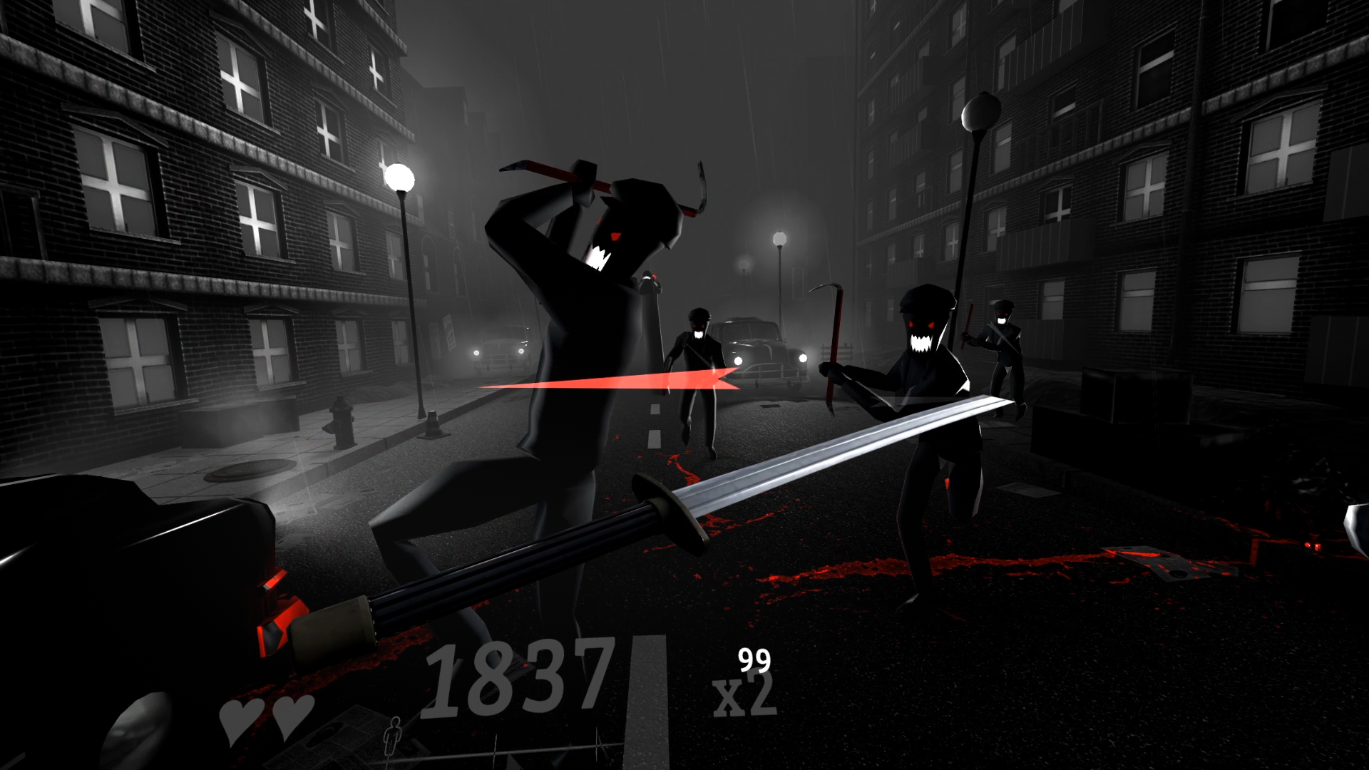
Therefore, we tried to make everything black and white, except for the interface elements and blood, and highlight the characters with contour lighting. It turned out much better.
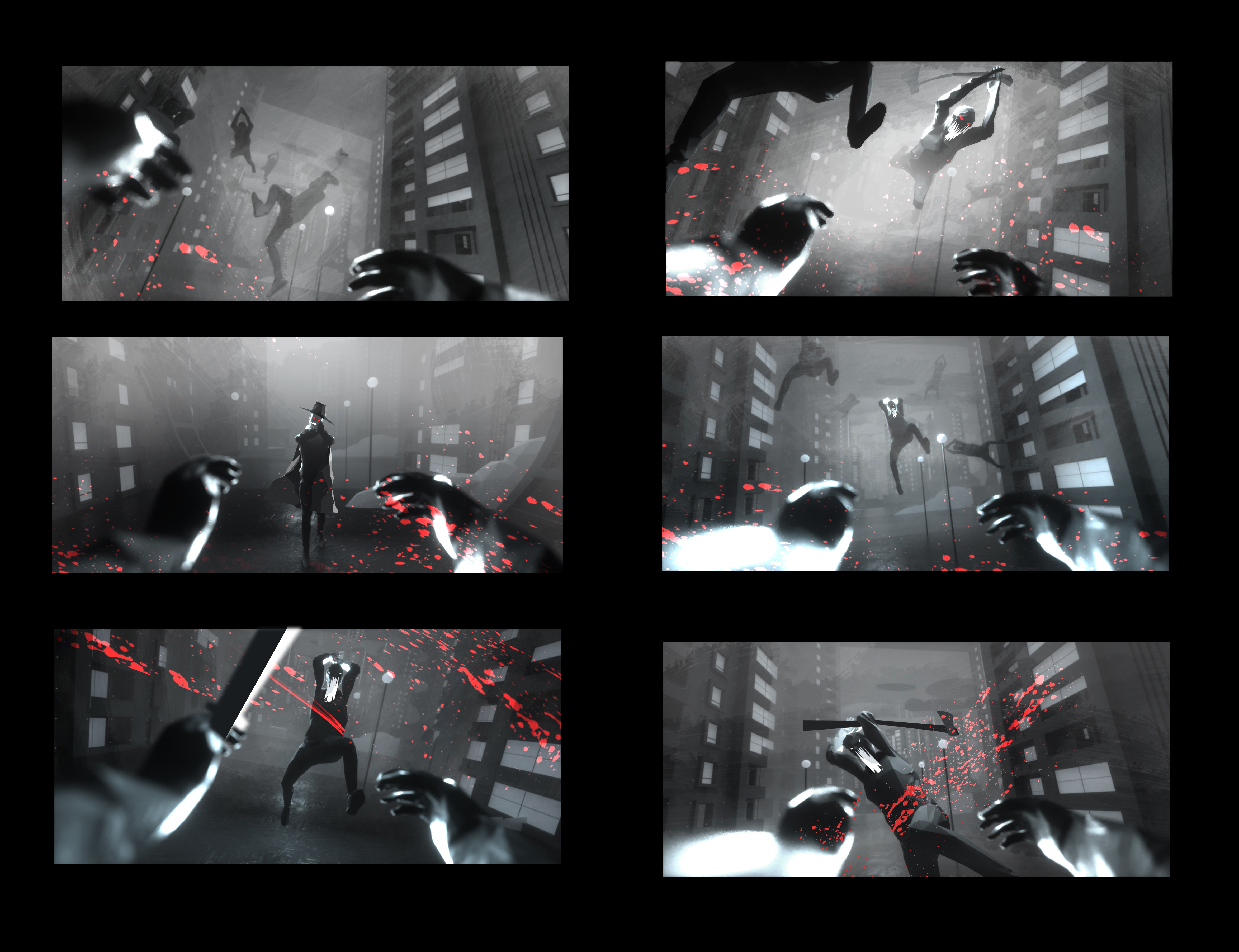
Noir style, concept art
Noir style, in-game
The visuals remained a little flat and we decided to add volumetric light (aka “god rays”) to additional light sources like streetlights and car headlights. This created an even more mysterious aura, the atmosphere of film noir.
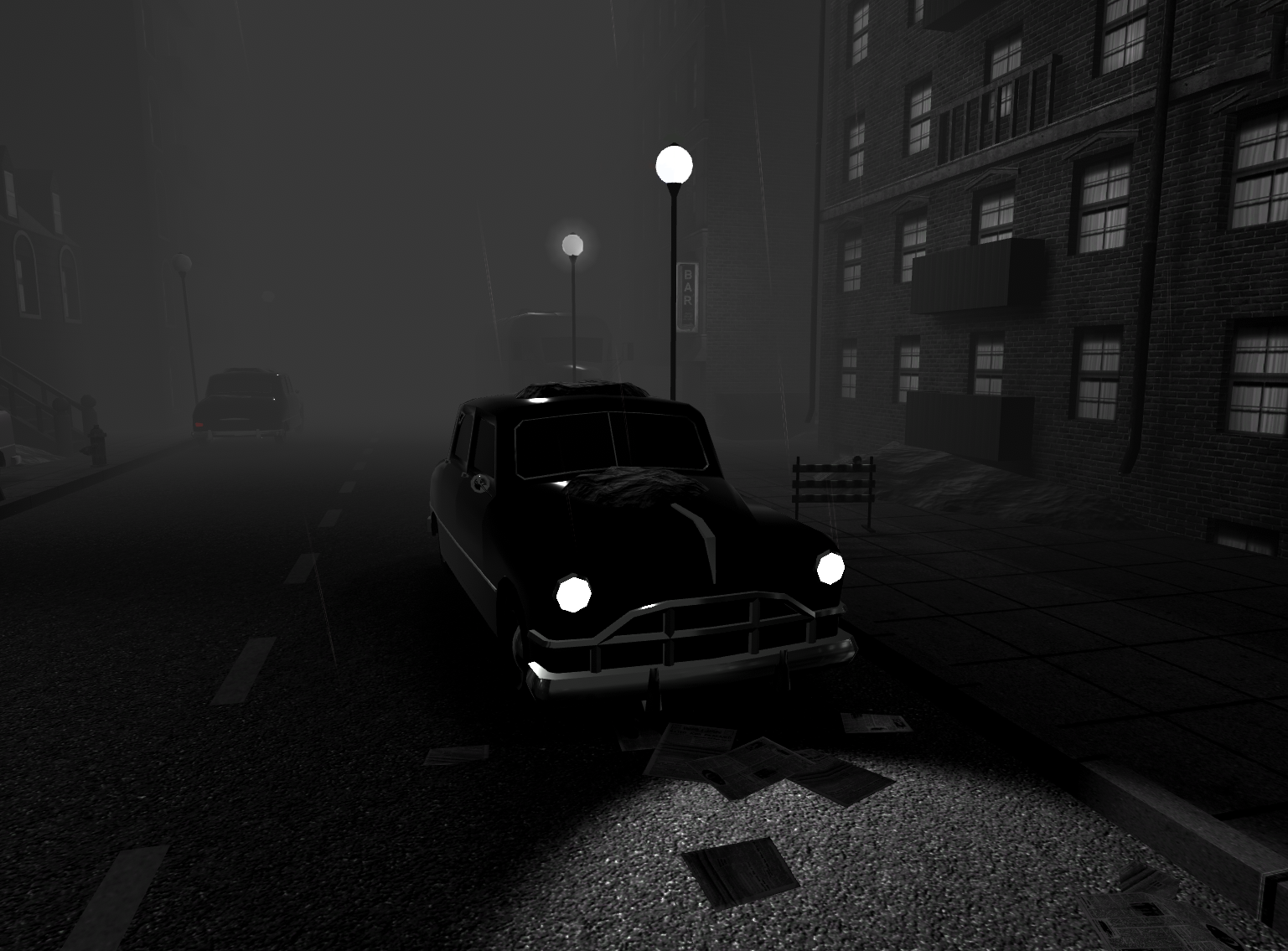
No volumetric light
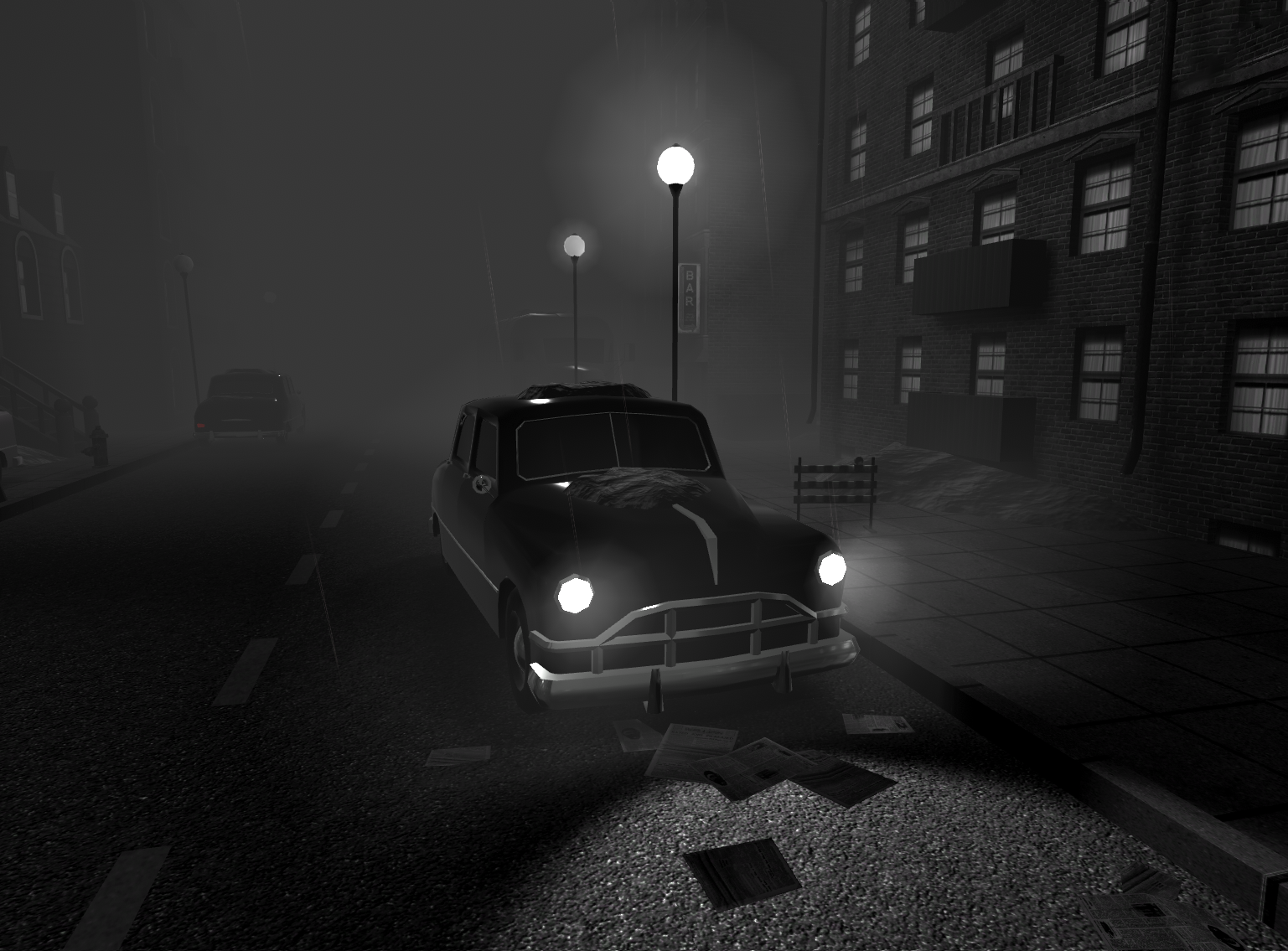
Volumetric light: on
Game announcement and a free demo.
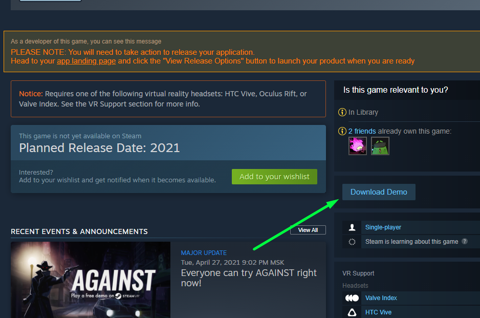
As the game began to look great and the main gameplay elements worked well together, so we decided to release the demo on Steam. We wanted to introduce players to our game and get more detailed feedback. You can play it right now for free, and we hope you do! We would love to get more feedback to further improve as we get closer to the final release.
The noir style must go?
The noir style doesn’t suit our goals very well. In the future, we can keep it as an option, but the main style will be colored. In the game, a lot of attention will be paid to locations that will be very different from each other visually, as well as have a variety of characters. The black-and-white style imposes limits in terms of music, which is bad for the modding community. We want the game to be played equally well with both electro swing and your favorite pop hits. Also, the monotonous visual style can quickly bore the player and reduce replayability of the game.
Therefore, the final product will offer more visual diversity. The main focus is on the characters and objects of interaction.
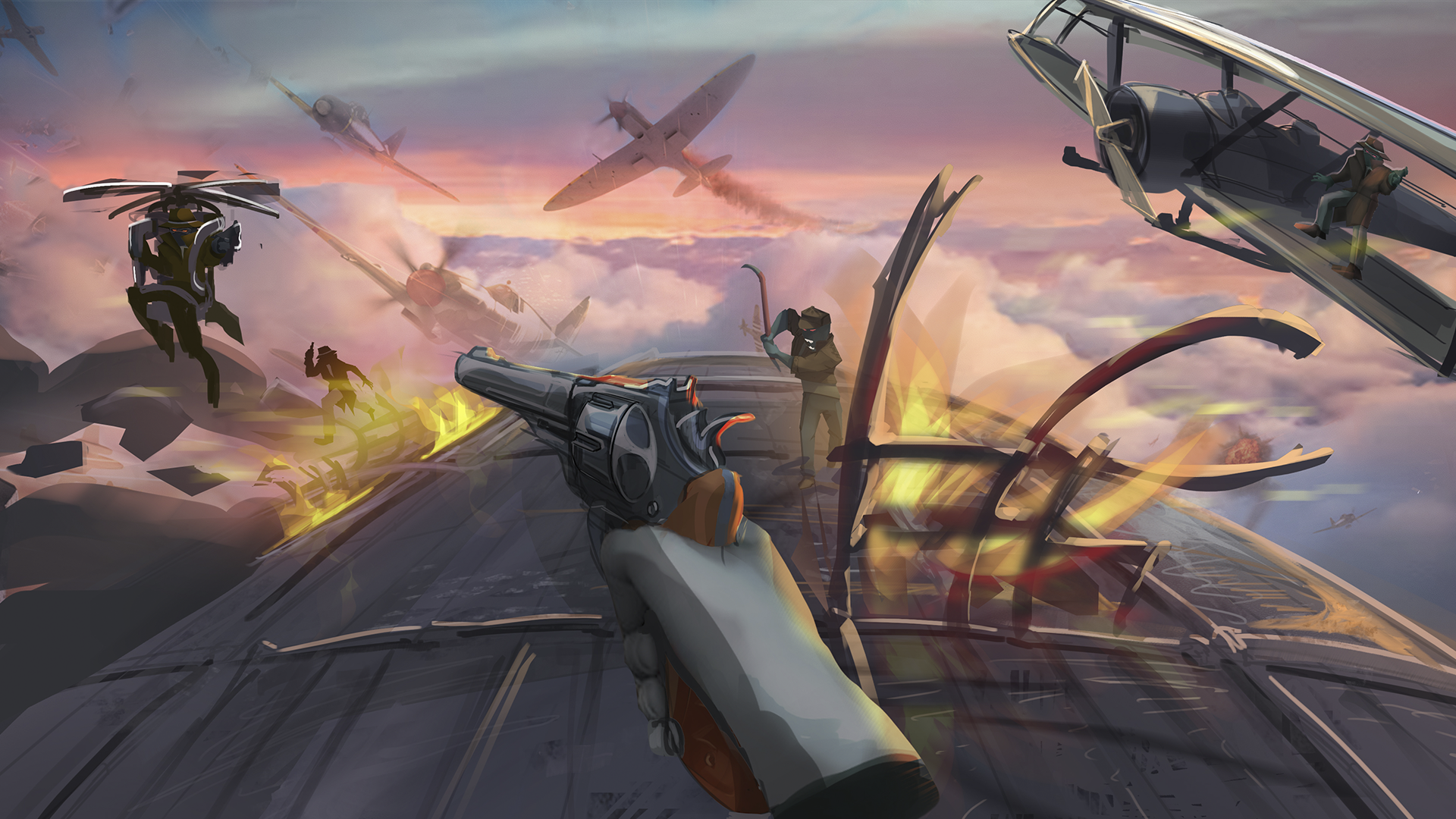
A sky battle level looks fabulous in color
VR optimization is a tricky process
The VR optimization process deserves special attention.
Developing VR games, especially for standalone devices, is very much like developing a game for the first PlayStation. Our 3d designer on the project watched a bunch of videos about how developers made games for it and he was always interested in how they managed to find creative solutions to overcome the strict technical limitations. For example, it was possible to display only 5 enemies on the screen because PS1 has very little RAM.
We have to work in a similar situation, we constantly face rendering challenges and have to monitor the displayed number of polygons in each frame. For example, most of the houses in the new style will be just square boxes with textures, and all the details (windows, window sills, etc.) will simply be drawn.
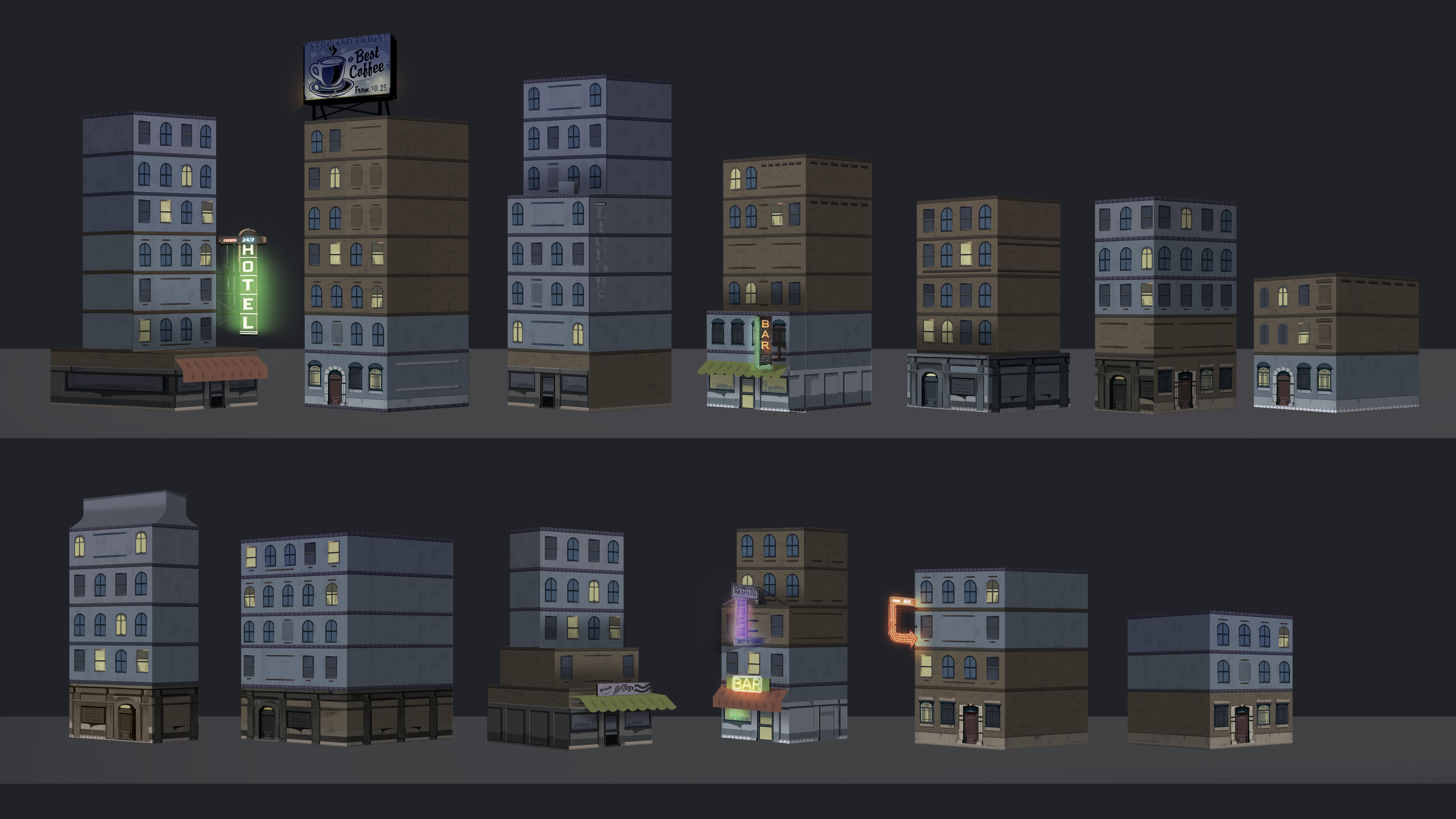
Good old boxes with textures
For optimization purposes, we can't make the shadows from the enemies to render in real-time, so we want to make them hand-drawn spots on the floor. At the same time, we didn’t want them to be static, but change their rotation depending on the position of the light source.
This means that when an enemy runs near a lantern, the shadow under them is affected realistically.
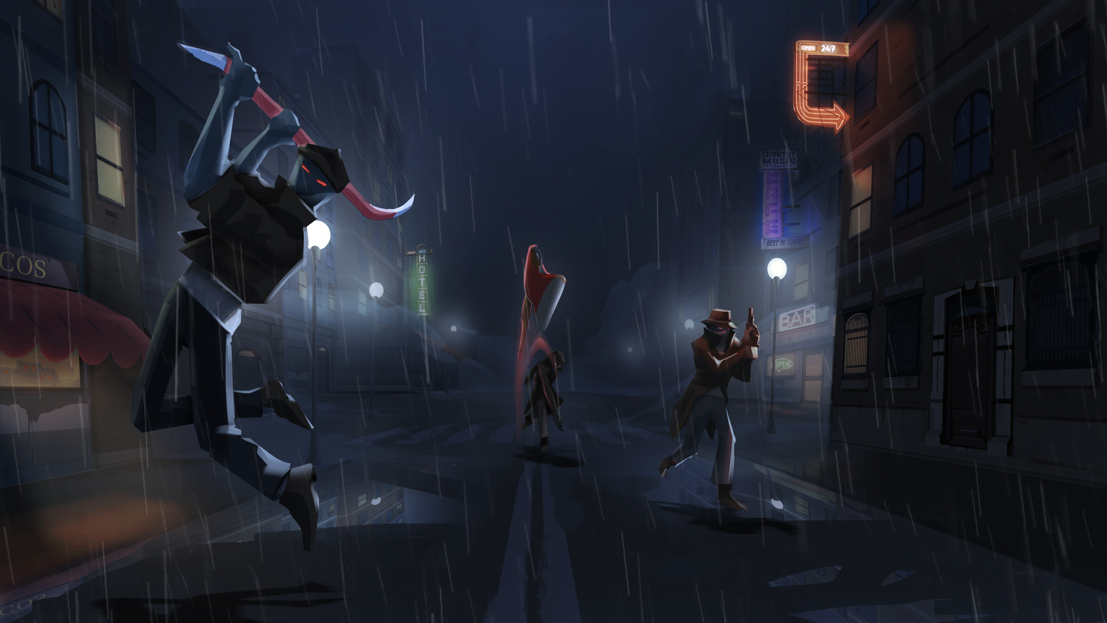
The city is teeming with shadows
Also, we probably won't be able to use post-processing of the frame and all the other options for contrast and color tone. Rather, we will do it on the textures themselves in Photoshop. And instead of real light reflections on the edges of enemies, there will be an imitation with the help of shaders.
Returning to the houses, we have reduced almost all the house models to simple boxes with detailed textures, while adding unique buildings as points of interest for the player, with more complex silhouettes and detailing.
Interactive points of interest
Balancing between mysticism and realism
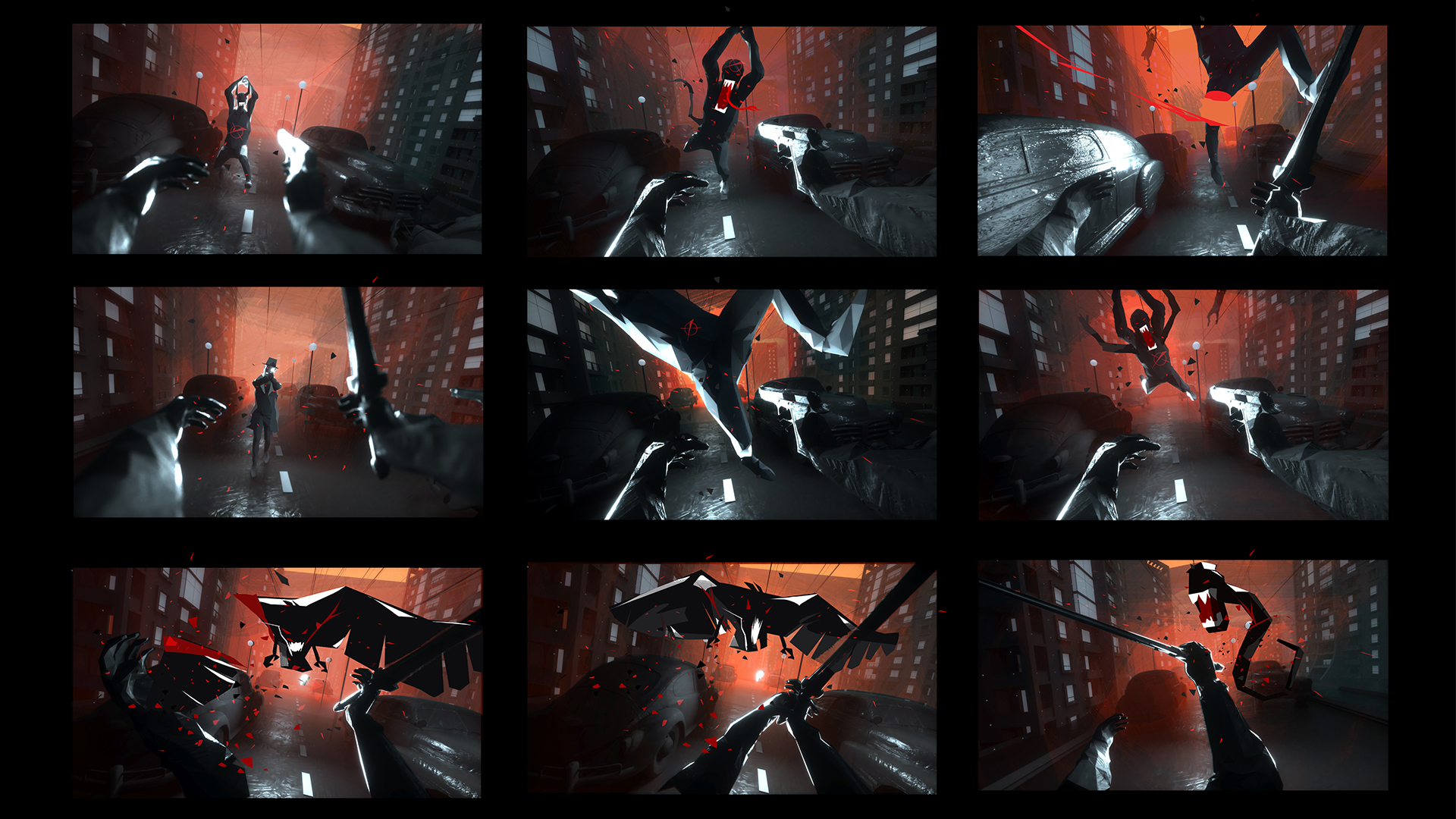
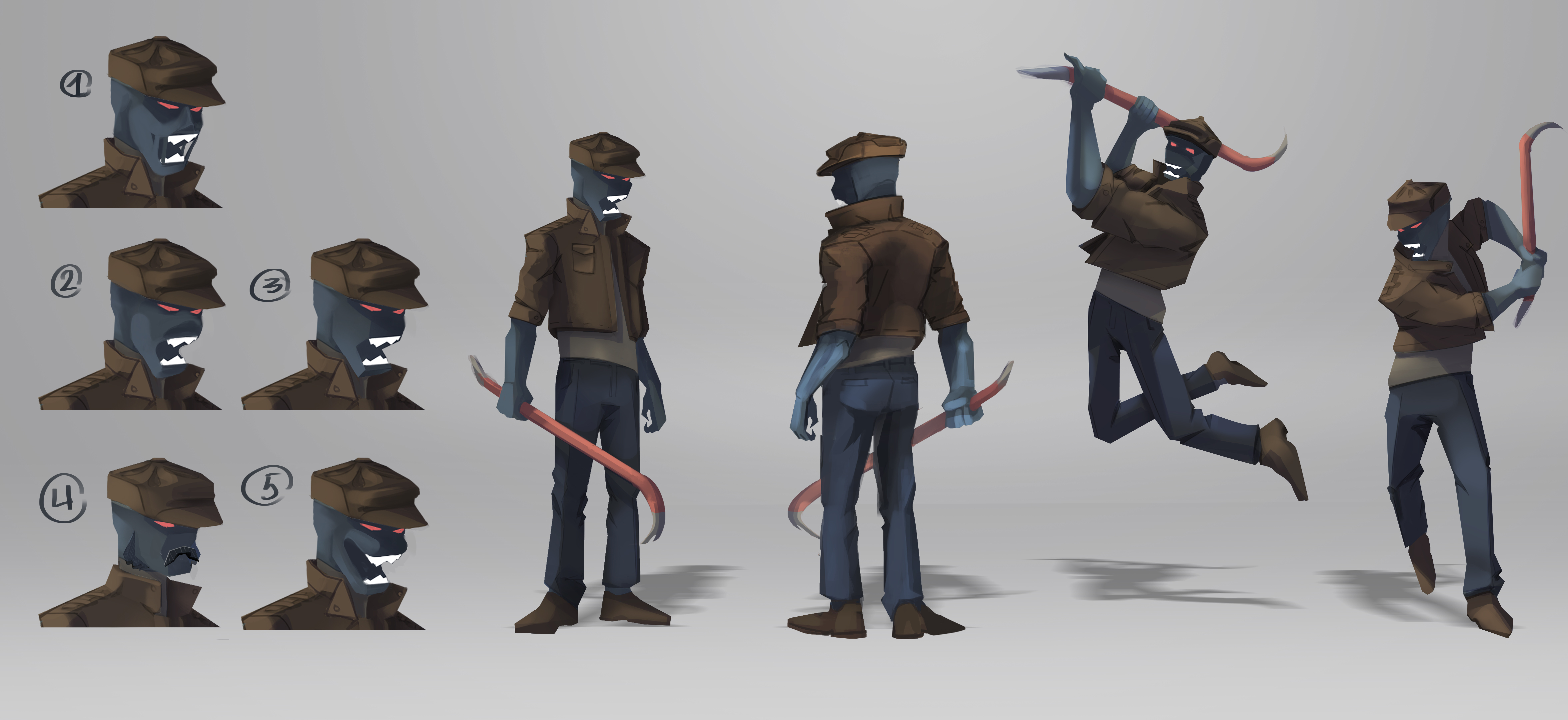
The main challenge in the enemy concepts is to maintain a balance of realism and mysticism to the extent that our Mafioso-nightmare-creatures fit eclectically into the setting, and don’t look ridiculous.
When we were preparing a replacement for the Venom model (what we in the studio call the enemy jumping on the player), the first thought was to make a lizard man from retro horror movies, a kind of amphibian, but the lead artist stopped us in time, and we came to a more neutral option - a werewolf.
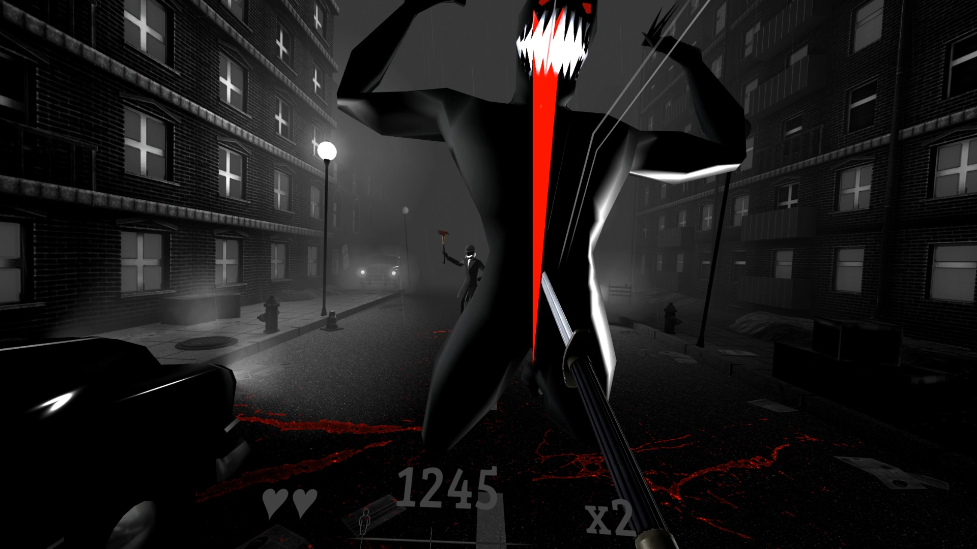
Current model of the jumping enemy (“Venom”)
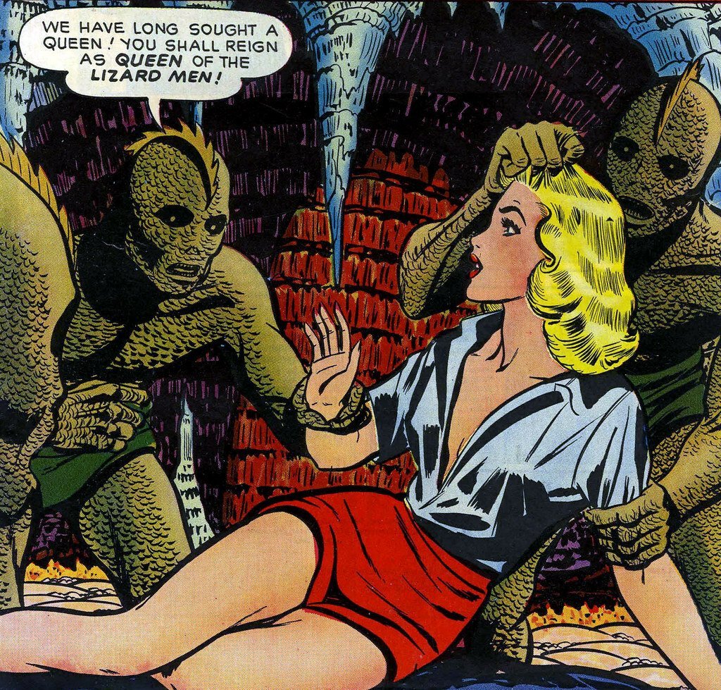
A reference for the lizard man concept
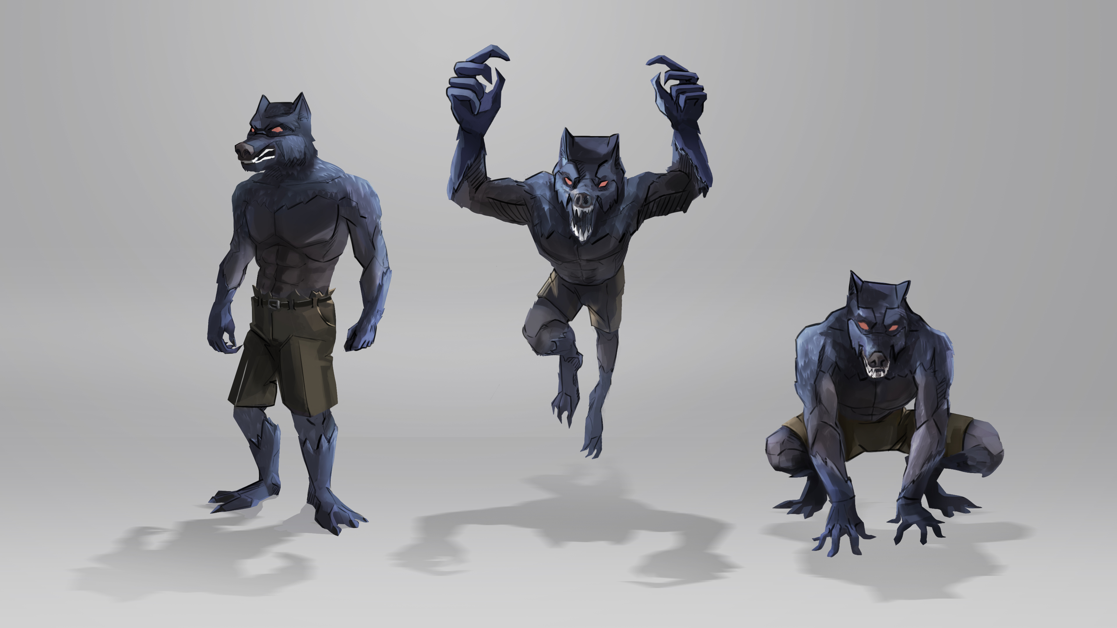
Final concept art of the new model – the werewolf
The perfect reference for us is the style of animated series by DC, for example, Batman, and their animation in general.
We were inspired by their sharp stylization and simplicity of forms, so that the silhouettes of our characters, weapons, and other things were highly readable and easily distinguished from each other.
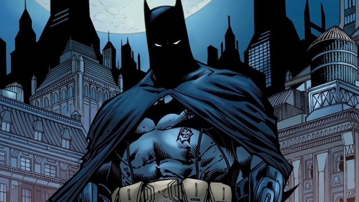
Sharp grotesque forms in DC animations
Easy-to-read enemy silhouette and animations
Bosses and… a story?
It is no accident that so much attention is paid to the visual design of enemies. For us, this is not only an element of game design (it is much easier for a player to navigate in what is happening at high levels of difficulty if different types of enemies differ visually), but also an element of a story narrative. Yes, you heard us right, the game will have a story component, all levels will be connected by a lore and a certain plot. You will learn more about the story closer to the end of development.
Bosses at the end of each level fit perfectly into this concept. They simultaneously test the player's skills, are a rewarding challenge for completing a level, and also close the level's story arc and tell a piece of the game's lore.
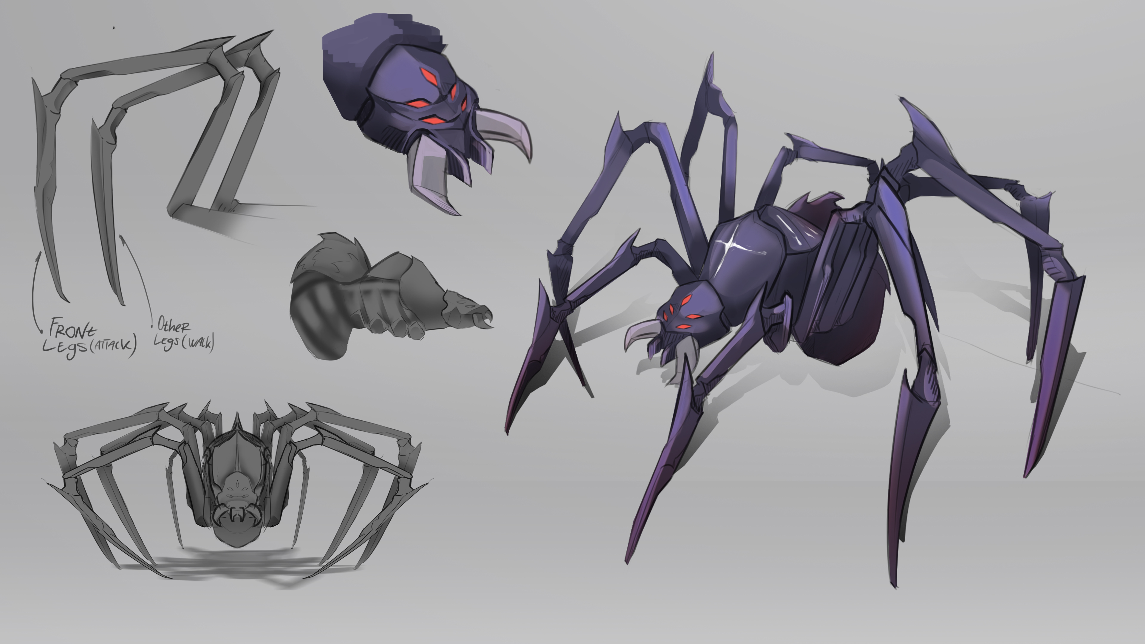
A spider boss
Give the game a try
Despite all the work done, the game is in the alpha stage and has more surprises for you, the players.
Right now, you can try out the demo of AGAINST on Steam to get acquainted with the key mechanics of the game for free. We will be grateful for any feedback in our Discord. Have fun!
https://store.steampowered.com/app/1584840/AGAINST/
P.S. The "Download Demo" button is located to the right of the wishlist button
Write your comment!